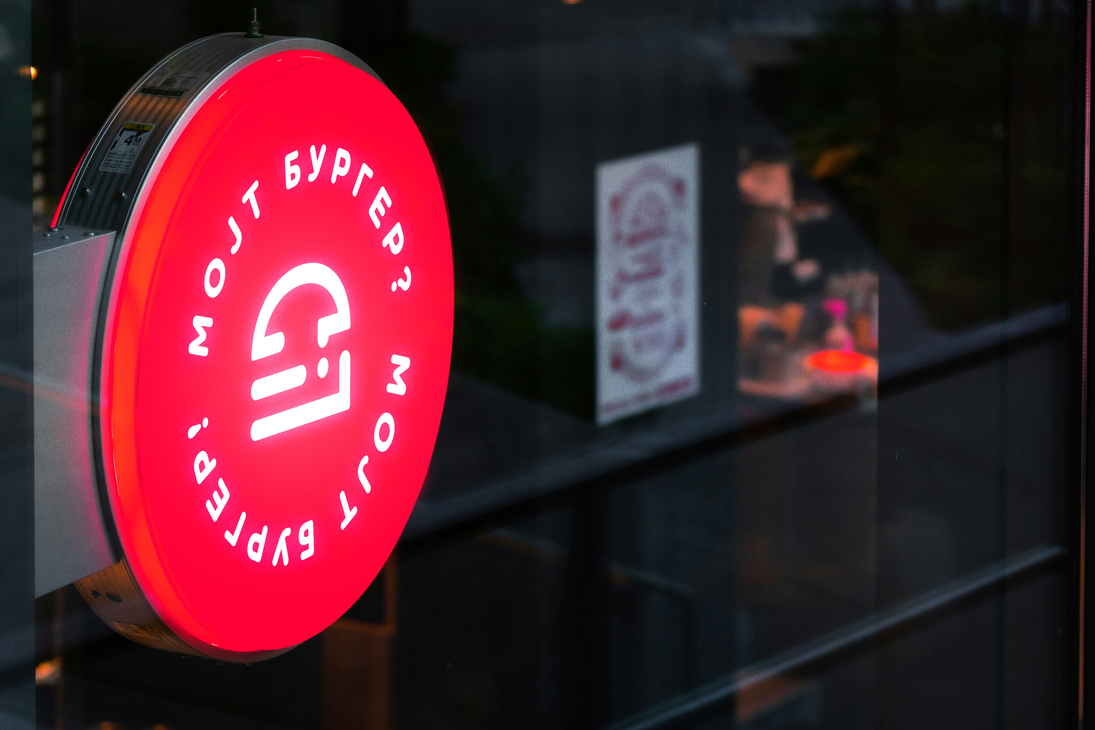
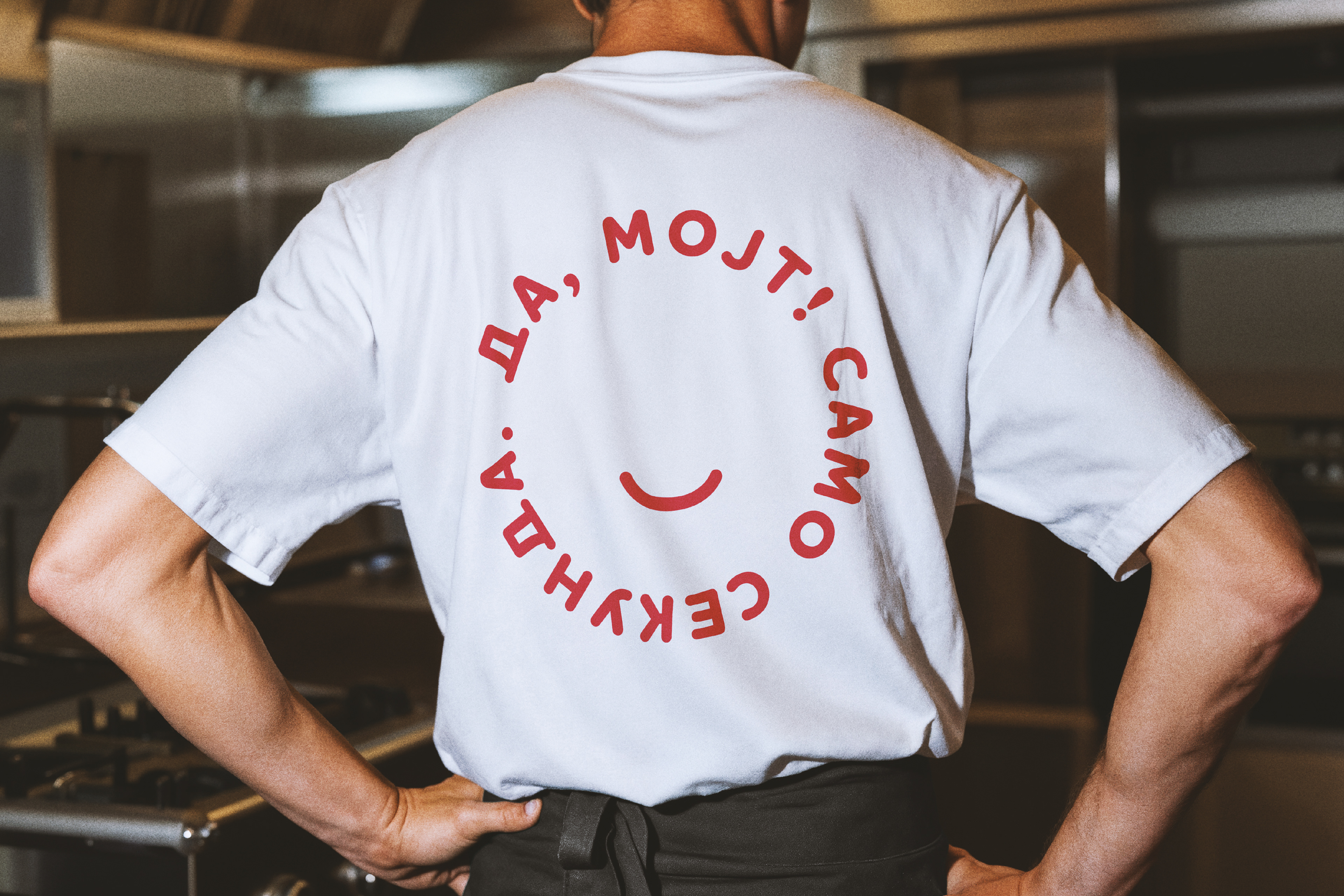
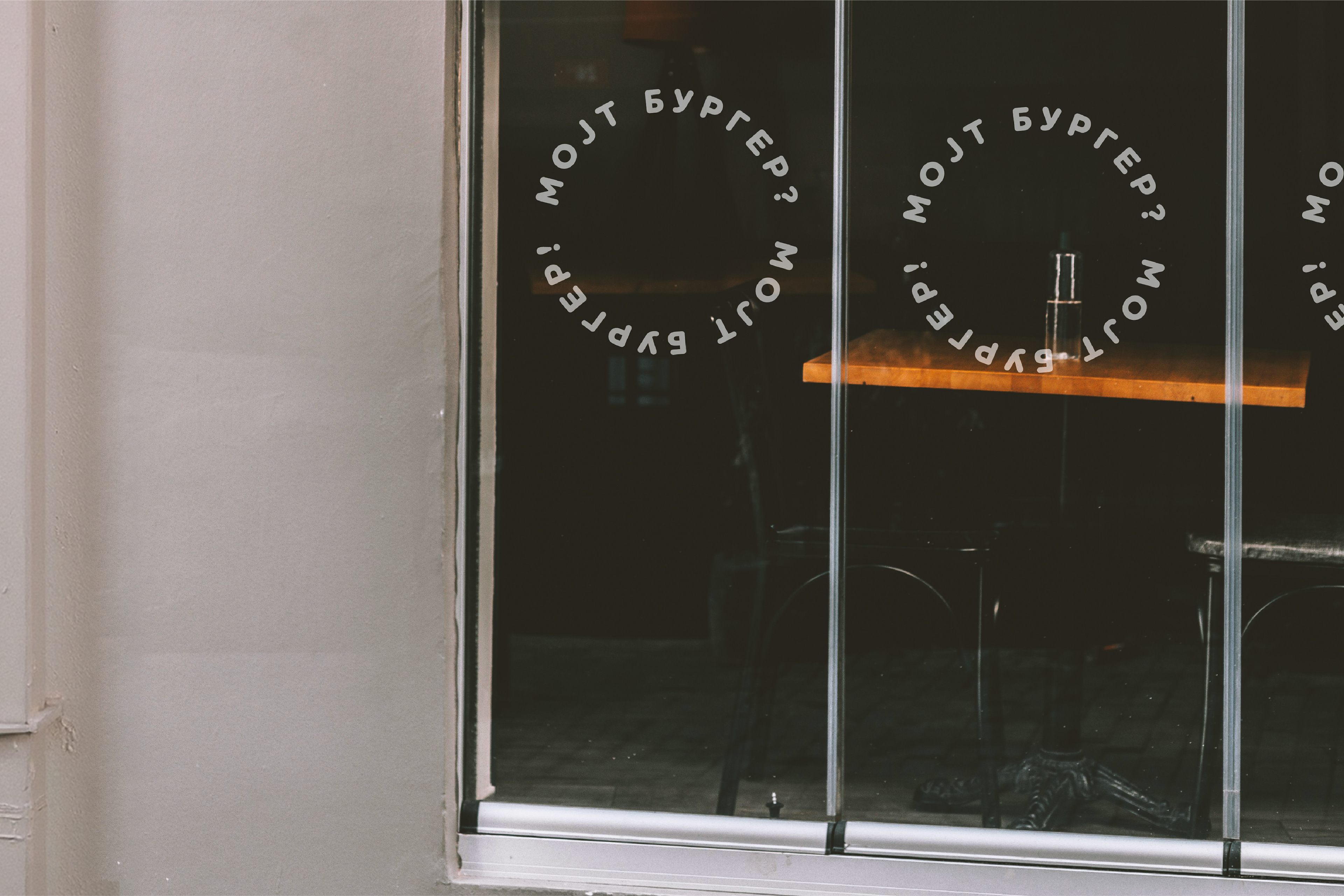
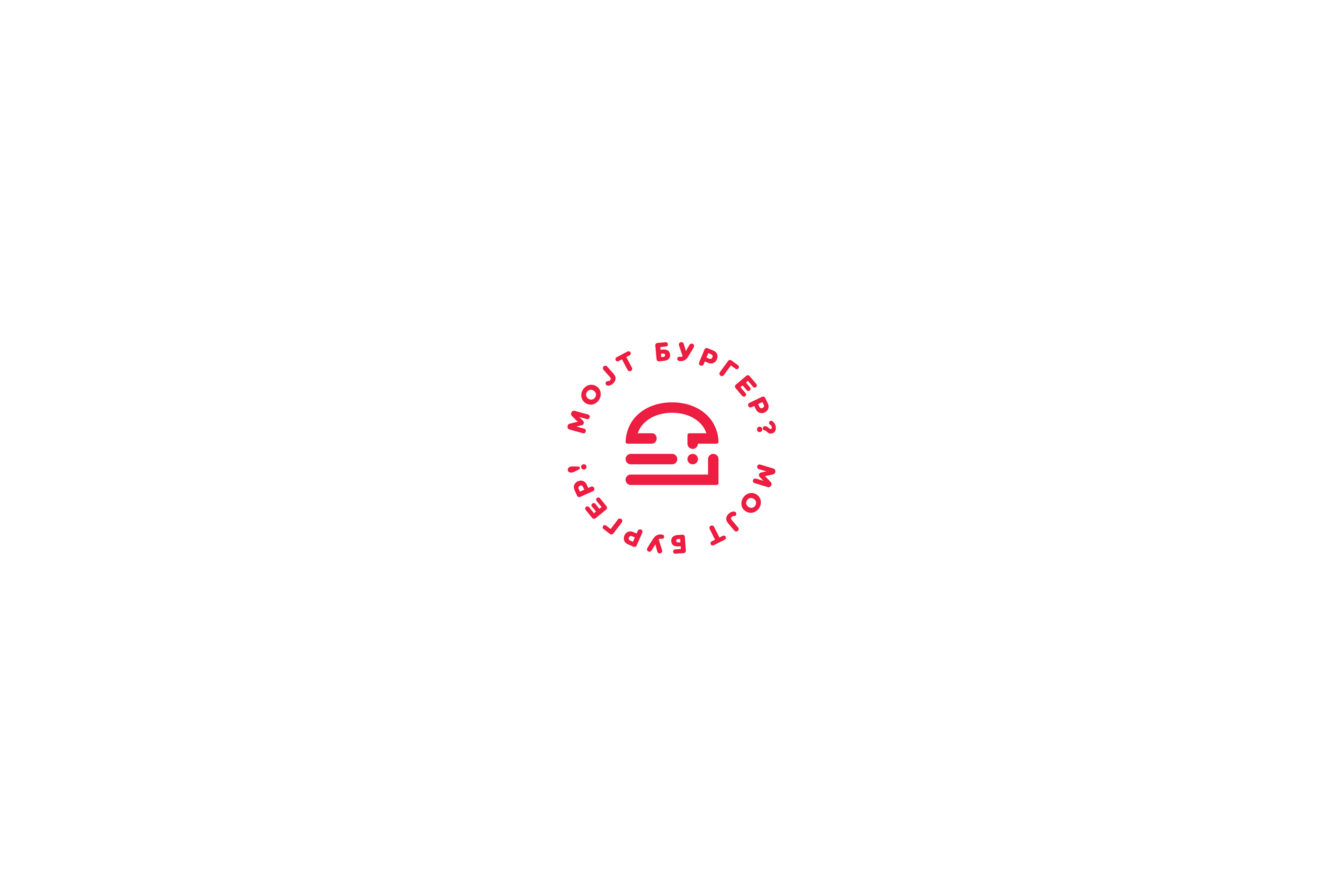
Created a brand identity for Мојт Бургер — a premium smash burger place in Ohrid built around local language and conversation.
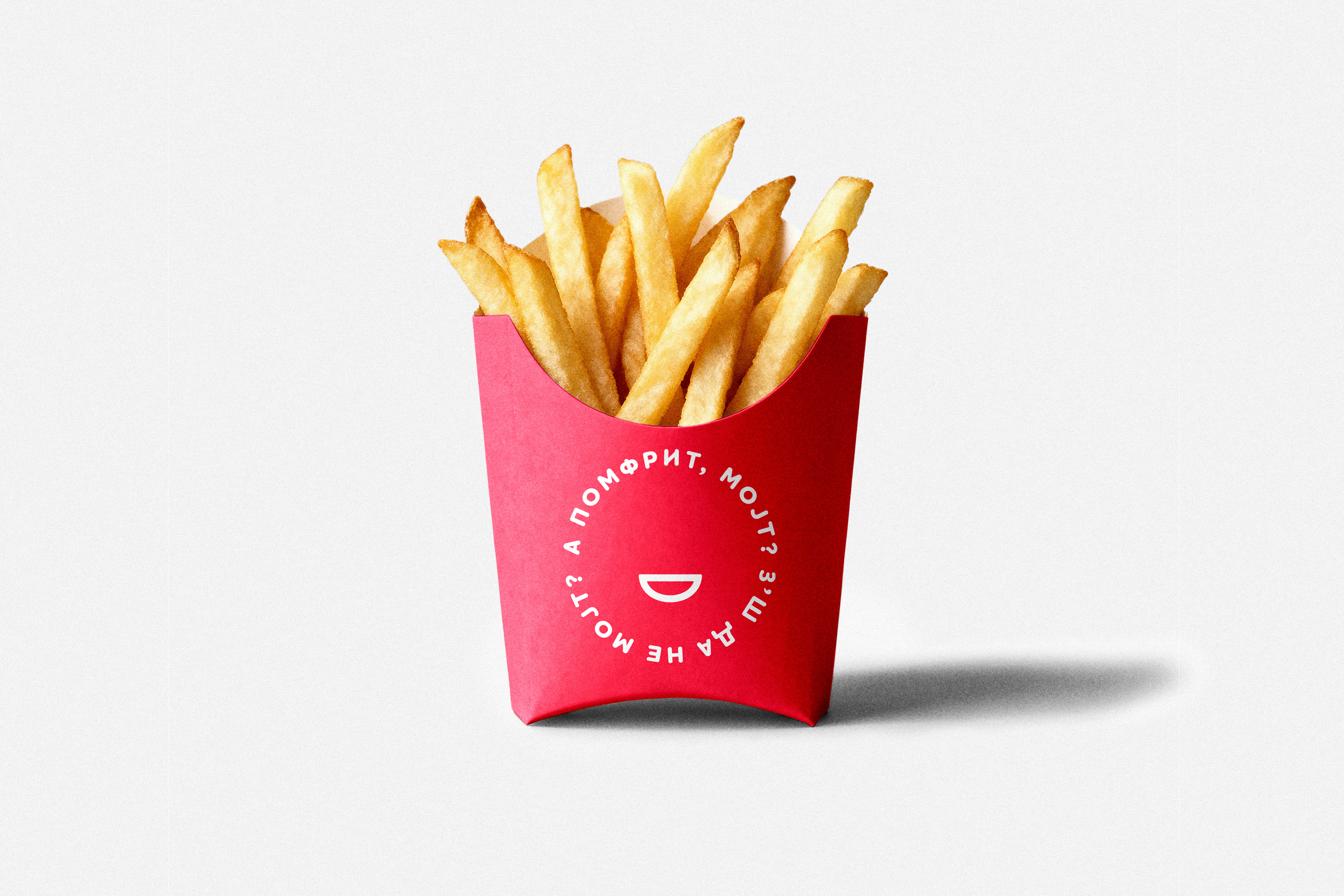
Inspired by the familiar Ohrid expression “Мојт Бургер?” and its changing meaning through punctuation, the identity transforms a simple interaction into a recognisable brand experience. At the centre of the system is a custom burger symbol created from a question mark and exclamation mark, paired with soft rounded typography and a bold red palette to create a welcoming and memorable visual language.
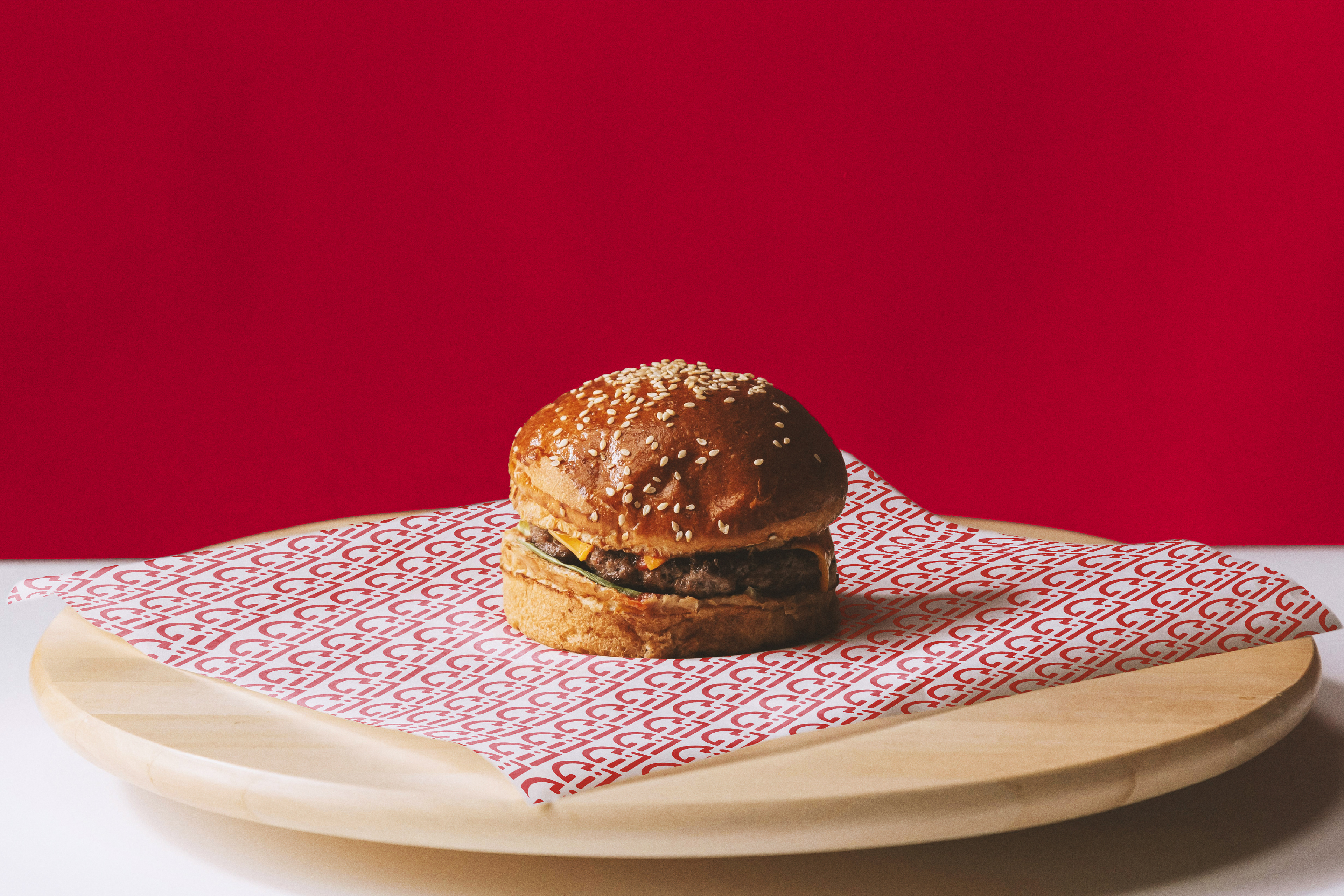
Extended across menus, packaging, uniforms and environmental applications, the identity was designed to strengthen local connection and build a distinctive presence from day one.
Scope: Naming, Logo Design, Brand Identity

More about the concept and design approach on Behance: