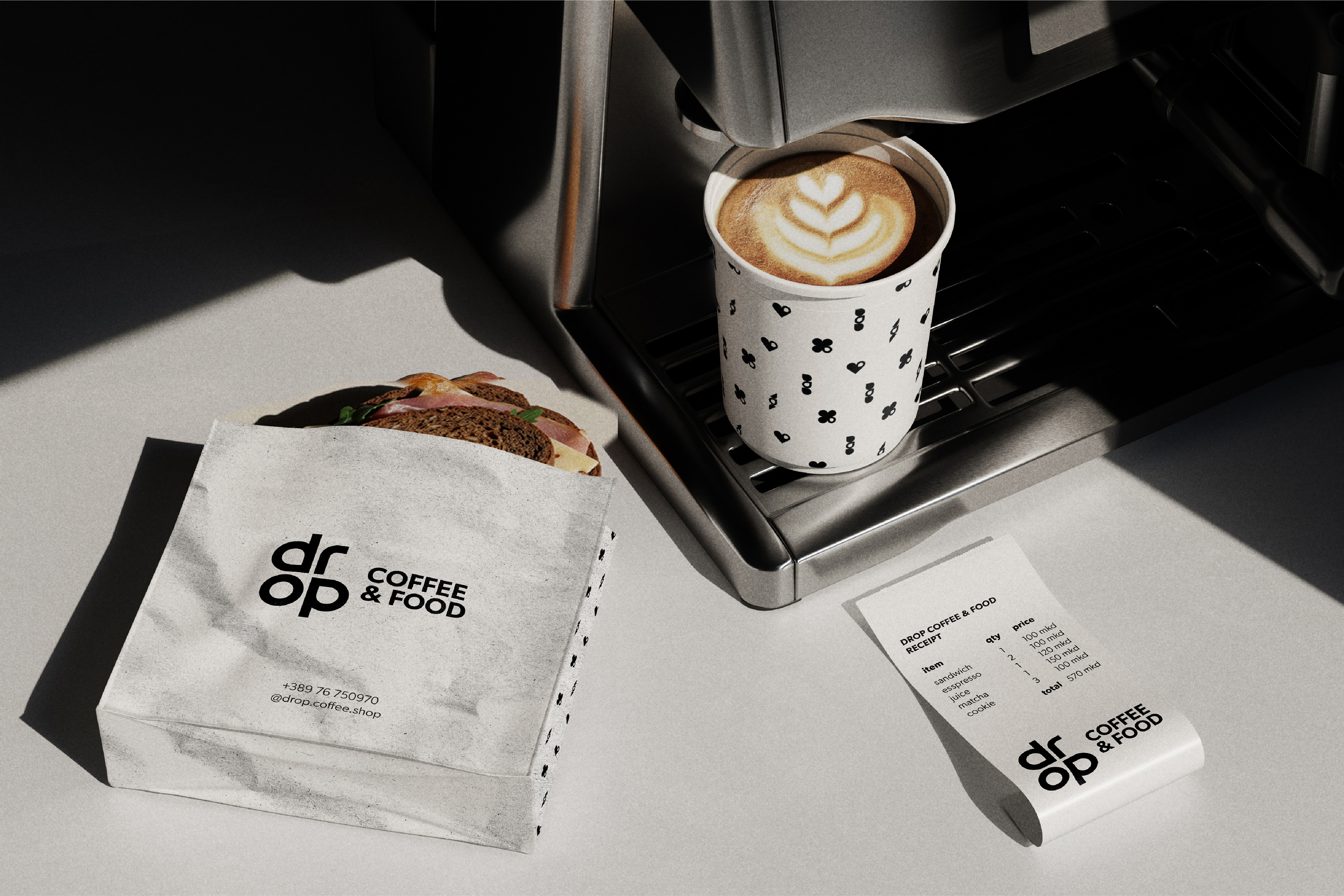
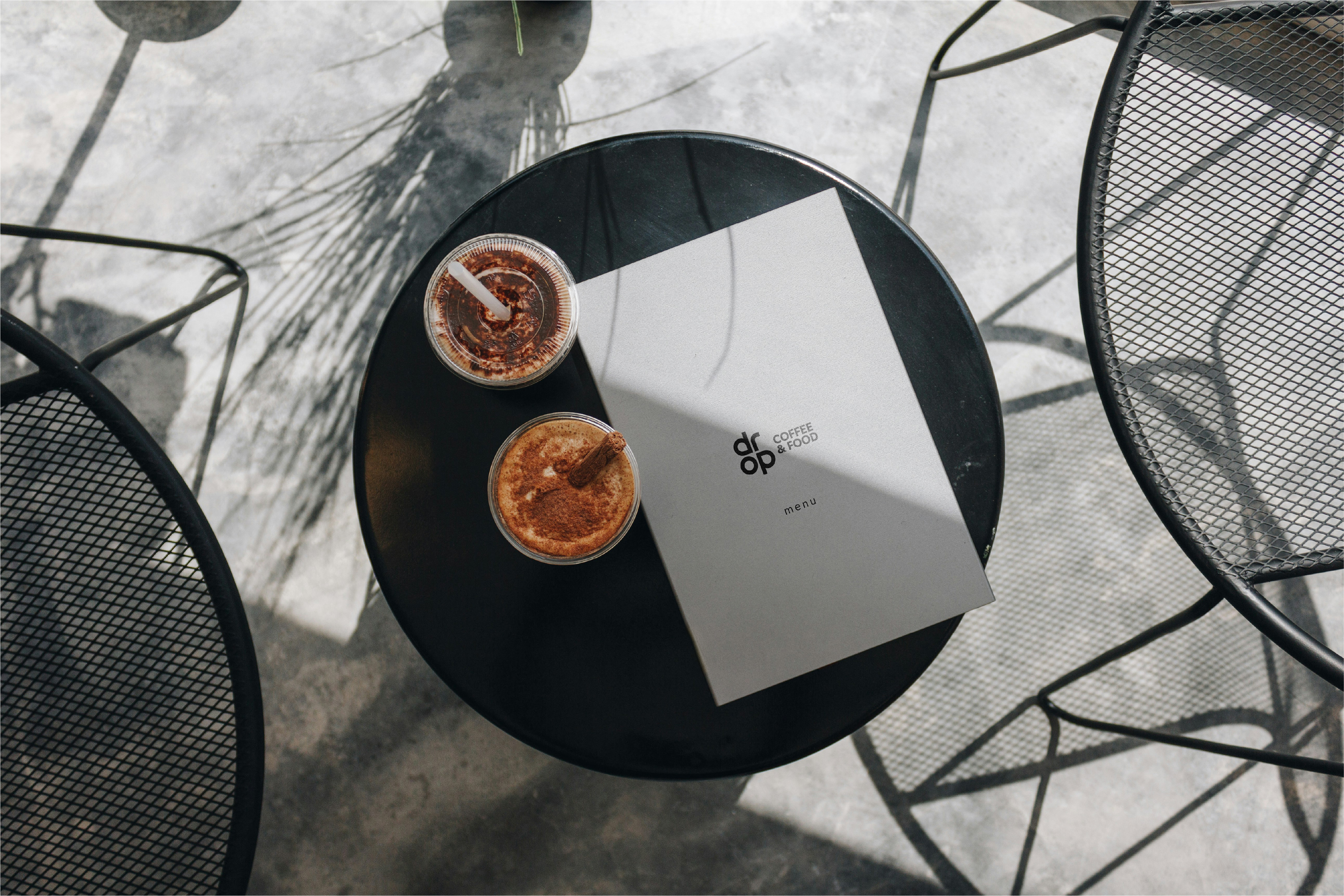
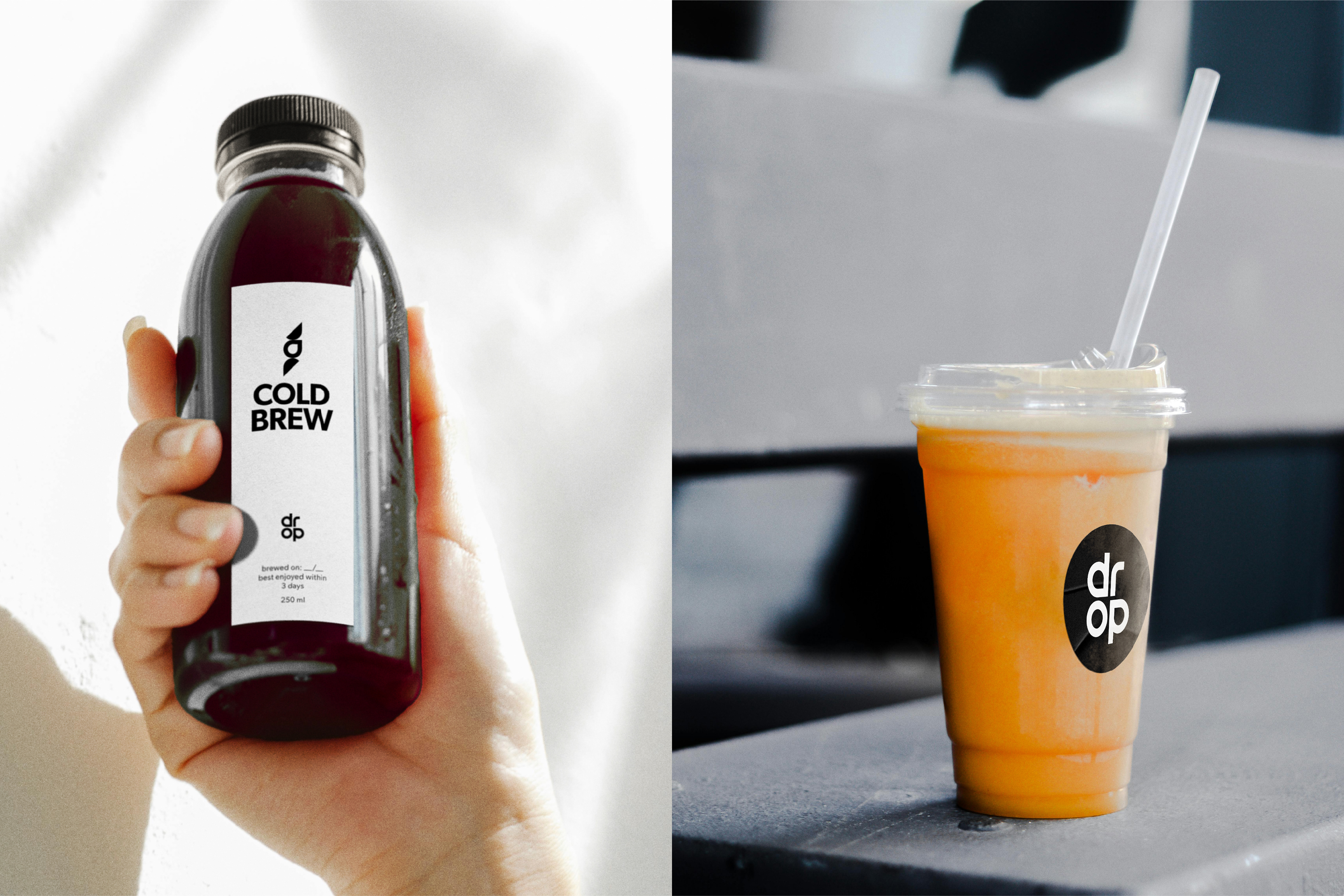
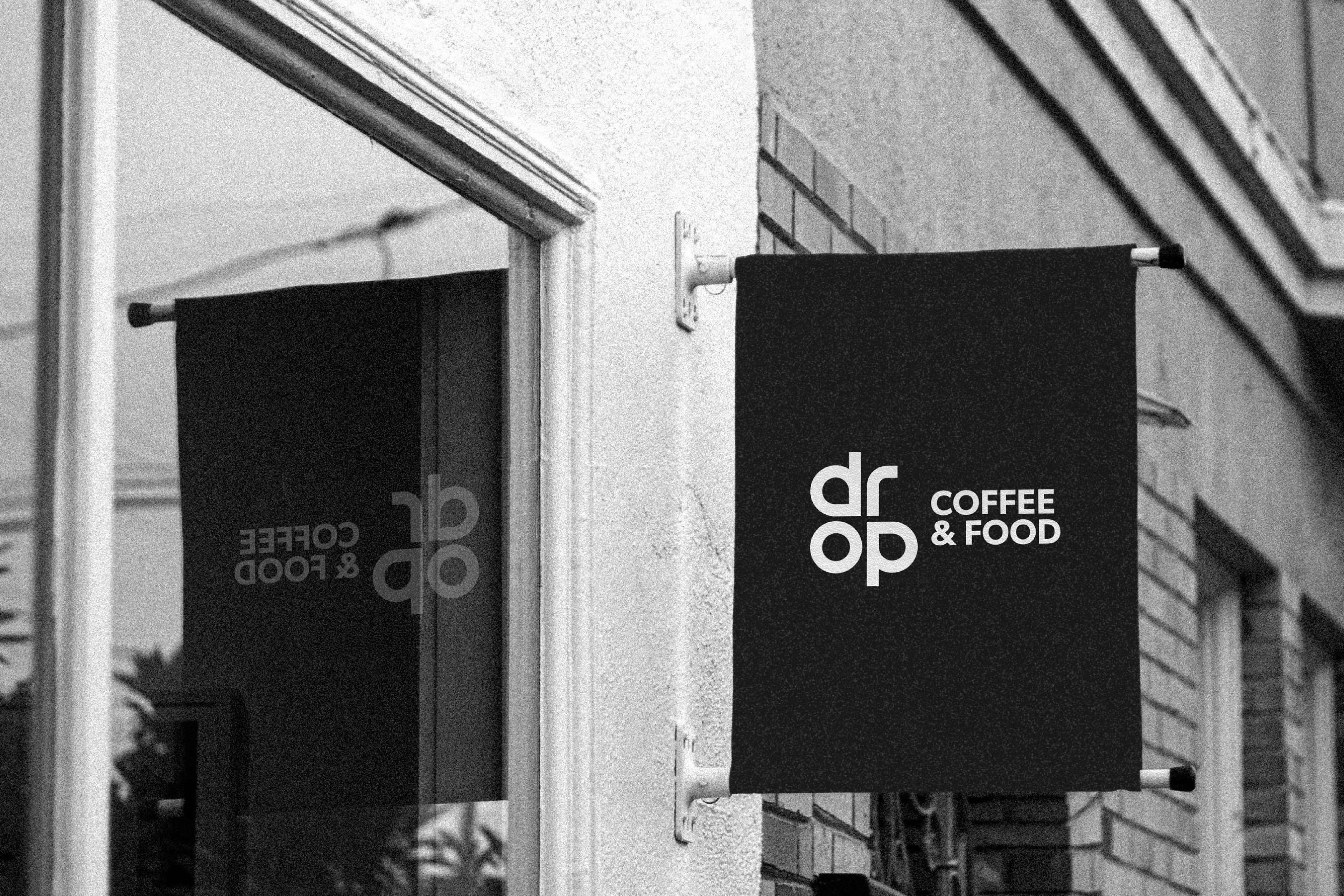
Designed a refreshed visual identity for Drop Coffee & Food in Ohrid, North Macedonia — a small takeout coffee spot known for quality coffee, fresh smoothies and healthy vegan-friendly food.
The identity was created to give the brand a more urban and premium expression while preserving its recognisable drop symbol. Inspired by nature as a source of renewal and connection, the custom wordmark integrates the drop into the letterforms, forming a subtle clover-like shape that reflects nourishment, movement, rest and human connection. Combined with geometric typography and a restrained black-and-white palette, the identity creates a clean, bold and timeless visual language.
Scope: Logo Design, Visual Identity


More about the concept and design approach on Behance: